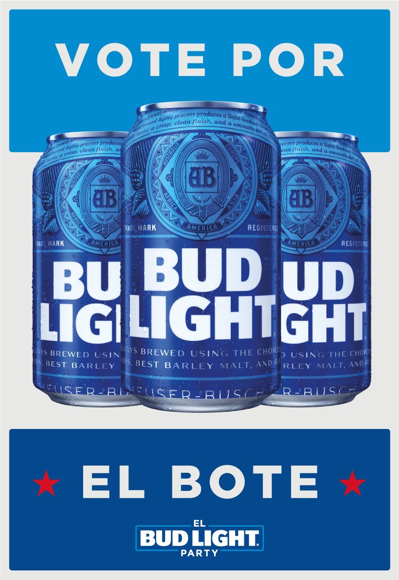
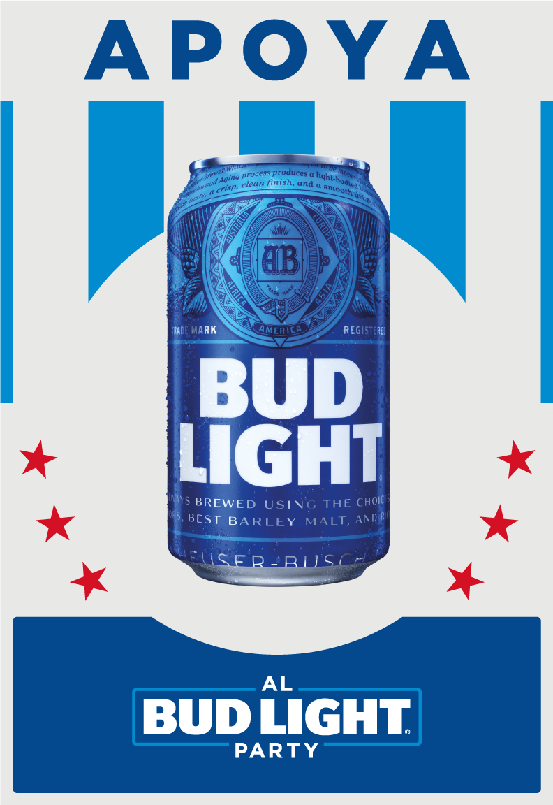
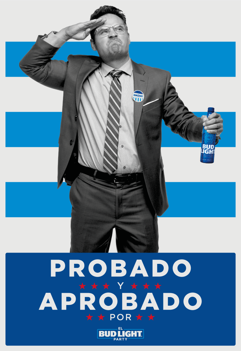
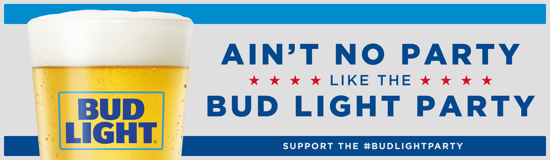
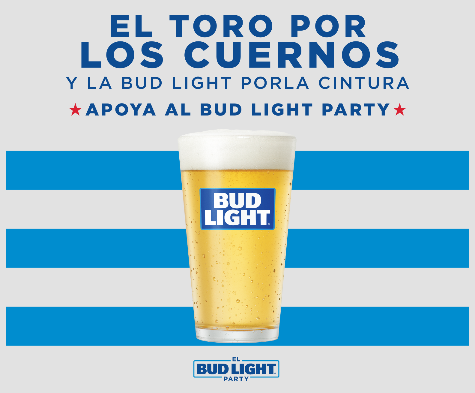
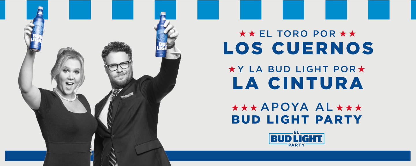
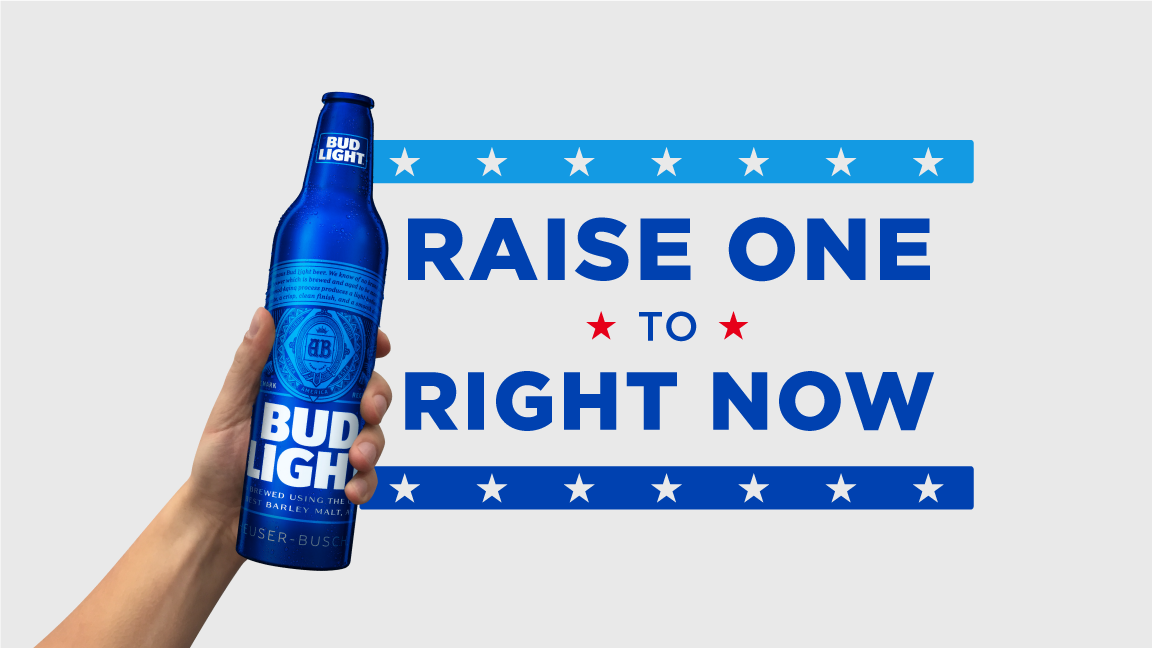
Bud Light needed a cohesive campaign look that could flex across packaging, retail, and promotional touchpoints. The goal: one clear visual language—bold, high-impact, and consistent—built to produce variations fast without losing the core idea.
Result
One repeatable campaign system that stayed consistent across multiple touchpoints and formats.
One repeatable campaign system that stayed consistent across multiple touchpoints and formats.
My Role
Lead Designer / Art Direction + hands-on execution.
Lead Designer / Art Direction + hands-on execution.
Highlights
- Led concept-to-execution design across campaign touchpoints
- Built a modular layout + typography system for fast variations
- Designed key visuals and templates for retail, promo, and packaging extensions
- Produced final-ready assets while maintaining consistency and brand clarity
- Led concept-to-execution design across campaign touchpoints
- Built a modular layout + typography system for fast variations
- Designed key visuals and templates for retail, promo, and packaging extensions
- Produced final-ready assets while maintaining consistency and brand clarity
Deliverables
Campaign visual system + layout rules, hero key art, OOH/poster suite, social asset templates,
in-store/POS designs, packaging/promo extensions, and a scalable production toolkit for rapid versioning.
Campaign visual system + layout rules, hero key art, OOH/poster suite, social asset templates,
in-store/POS designs, packaging/promo extensions, and a scalable production toolkit for rapid versioning.